Best design practices: Creating a high-performance HMI

When SCADA interfaces were first introduced, there were no guidelines or standardisation for graphics. Although there were common HMI depictions, these were often ineffective due to factors like inconsistency, improper use of colour, and a lack of visibility of trends and equipment health information that were essential in enabling operators to quickly determine how processes were running. As computing processing power increased, so did the available graphics, but poor design practices persisted, failing to support operators’ needs. Often operators could not easily tell what was running or any abnormalities that had occurred.
As a general rule in HMI design, poor graphics result in poor operating practices. Human error is the leading cause of safety incidents in industries such as oil and gas production, refining, chemical, power, mining and rail, and the cost can be catastrophic. For example, in the Texas City Oil Refinery disaster in 2015, which resulted in 15 people being killed, 180 people injured and $1.5 billion of damage, a poor HMI was cited as a significant contributing factor, with operators unable to tell from the HMI that they were continuing to feed fuel into the fire. Providing operators with the tools to make informed decisions is essential.
The ISA-101 standard
In 2015, the ISA-101 HMI Design Standard was published. This standard lays out the minimum requirements for HMI displays, including their design, documentation, and management of change. Very concise, ISA-101 provides overall design guidance and a workflow for developing and managing HMI systems, including change management. For truly effective HMI design, however, there needs to be a focus on operator efficiency and creating screens for situational awareness and operator tasks. In addition, companies need to go beyond ISA-101 to train operators to use the HMIs. Facility owners must develop a clear HMI philosophy document and style guide for the HMI system. To further improve efficiency and decrease human error, reusable software toolkits of screen elements should be developed. The goal is to produce a true high-performance HMI.
The high-performance HMI
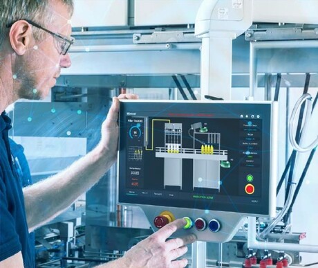
The aim of a high-performance HMI is to provide simplified interfaces that speed operator response time, and improve problem and alarm resolution, while reducing errors. Instead of portraying a real-world representation of the machine or process, operators need information reflected in a manner that is easy to scan for anomalies and identify areas that require further investigation and action. High performance HMIs incorporate application-specific and personalised screens that help operators achieve a purpose, spend less time searching and navigating, and allow them to make better decisions faster. Keeping the HMI simple also makes it easier to train the next generation of operators. An effective interface is easy to learn, leads to faster reaction time, and enables safer operations and higher productivity.

Basic concepts for designing a high-performance HMI
When developing a high-performance HMI, one of the main principles is using moving analog indicators instead of just numerical displays. The analog indicators will display the span of an instrument, show abnormally high and low values, and high-high and low-low process values. With these analog indicators, operators only need a quick glance to understand the status of the process.
ISA-101 basic concepts include but aren’t limited to:
- Using a tight scale to make changes immediately obvious to the operator without the need for keystrokes.
- Effectively using colour is fundamental to high-performance HMIs, and colours need to be used consistently.
- Using a light grey background colour, helping to reduce glare and operator fatigue.
- Keeping foreground colours to a minimum and using them sparingly to indicate abnormal situations and to draw the attention of the operator.
- Making sure line thickness is consistent, and styles are restricted to solid, dashes and dots.
- Keeping arrows indicating process direction to a minimum to decrease confusion.
- Depicting process equipment and vessels in 2D, avoiding shading and gradients.
- Avoiding overcomplicated equipment drawings, with unnecessary detail, such as inner workings. Focus should instead be to display only elements that enable the operator to know what is happening.
- Consistent process flow across screens, and in general, flowing from left to right, vapours up and liquids down.
- Minimising the use of static text that names or describes objects, and keeping abbreviations consistent.
- Depicting live data differently from static text with a different colour (usually blue), and with units of measurement shown.
Fundamentals of designing a high-performance HMI
User interface (UI) optimisation focuses on the look, feel and functionality of the HMI, while user experience (UX) optimisation focuses on maximising the positive experience of the operator when using the HMI. Both are very important to the overall success of the HMI design. When both work together — a simple enjoyable experience complemented by a good look and feel — an ideal operator interface is created.
Designing the HMI with the end user (operator) in mind requires focus and understanding of how an operator monitors and controls the process, and what their needs, limitations and expectations are. The experience should be intuitive, as simple as possible and focused on real needs, not ‘pretty pictures’.
In designing for the intended user, the operator, it is not necessary to try to accommodate the needs of others, such as supervisors, engineers, and maintenance personnel. The goal is for the operators to quickly spot abnormalities or devices that need diagnosis, without the need for trained maintenance engineers to interpret information.
When implementing an HMI on a brownfield site (overhauling an existing HMI) there may be resistance to change since it always seems easier to stay with the known. That’s where the HMI philosophy and style guide come in. These documents can explain the benefits of a high-performance HMI and the potential benefits to the operators and the company. Creating an HMI philosophy document lays the groundwork for the design of the HMI and provides guidelines to ensure continuity across multiple control solutions.
The style guide is a detailed document specific to the project that includes all aspects of screen layout, including colour, line size, font size, objects for pumps, valves and tanks, and navigation elements. The HMI philosophy document and style guide help to maximise the control system capabilities and improve the chance of project success.
The style guide also documents and helps to standardise screen objects used when creating displays. Each object, designed according to ISA-101, has its own function in the control system, and will be used without modification, across all displays. The objects are contained in a library, which enable the control system to be designed using a drag-and-drop environment. This development methodology leads to reduced errors, shortened development time and lower costs, as well as increased profitability.
Data is not information
Individual figures on their own do not support operators well, especially inexperienced operators who may not be able to interpret the data. It is important to provide a scale, desirable operating range, alarm range and indicator as to good, normal, or poor performance. It is also important to embed information into the HMI, where operators can drill down to gain detailed explanations of alarms, potential problems, and solution steps. Alarm indicators should be shown in multiple ways, with different colours, shapes, and text. Always providing visible trends rather than separate trend screens or pop-ups keeps operators better in touch with operations.

Conclusion
Today’s high-performance HMI goes far beyond pretty, impressive graphics, to literally maximise the efficiency and accuracy of operators. This efficiency, in turn, impacts operation productivity, reduces errors, avoids shutdowns, and increases profitability. Despite fear of change, the ease-of-use and simplicity of high-performance HMIs, such as the Movicon.NExT platform that wins over operators quickly and produces fast results because of the highly modular and scalable platform saves time in development and operator learning curve. From machine HMIs to full plant SCADA, Movicon.NExT is a cost-effective and easy-to-implement, high-performance HMI that is a small investment for a big and positive change.
Movicon.NExT is a powerful platform for Windows or Linux HMI projects, SCADA supervisory systems and plant analytics solutions built for easy deployment using drag-and-drop, HTML 5, .NET Framework, and new generation WPF graphics for improved plant visibility.
Download your fully-featured free version today here.
AVEVA Plant SCADA 2020 R2 taps into the full potential of the AVEVA portfolio
When Citect became part of Schneider Electric and then AVEVA, Citect SCADA was integrated with...
Citect SCADA lives on as AVEVA Plant SCADA
Citect SCADA has been a trusted SCADA platform for over 35 years and continues to evolve.
Securing your PlantPAx system in The Connected Enterprise
Integrating industrial automation and control systems with enterprise-level systems enables...


